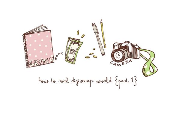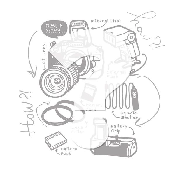
I always loved photography. Always. And when on my 17th birthday I've got my Nikon D40 I fell in love with it immediately. I loved holding it in my hands, loved to carry it with me everywhere, and I was happy like a puppy if I could take one good snapshot. It was easy enough to understand the basic functions of this camera but I've never got into details (I didn't even read the manual *blush*). Two years passed and during this period I bought external flash and a 18-105 mm 3.5 lens. I was VERY happy. But one day, looking at my photos I wasn't satisfied with them anymore, I wanted something more. And then crazy researches started. I was searching for the camera that could fulfill all my expectations without leaving me bankrupt. And then I saw Nikon D700...........and decided that whatever it takes I am going to own that camera. I couldn't sleep, couldn't eat and even think! And then during one month I managed to save enough money to finally purchase it. When this babe arrived home I knew that I made the right choice. LOVED it at first sight. BUT there was a problem. Despite my great love to photography I didn't know how to use it. Yes, that's right. I still didn't read the manual (of both of the cameras). My mum suggested me to go to take photography classes but I didn't want. I don't know why but I thought that people telling me how to shoot wouldn't benefit me a lot. So I started buying books. LOTS of books. And magazines too. And after a while I started to understand what is ISO, DOF, white balance, bracketing, etc. This knowledge made my photos better. But there are still a whole lot of things I need to learn. The reason I decided to post this on my blog, is that all these terms can be very confusing sometimes therefore I'll be writing what I learned new and be posting here at the same time checking if I really understood what I learned (sounds crazy, huh?). Let's start our journey.
Lesson number 1: Don't shoot your models/objects when sun is shining right on them
Don't know why but I always thought that when sun is shining right at your object is good. No wonder I kept taking horrible overexposed photos. And then after doing a research and much practice I got it right. It turns out that the sun should be behind your models/objects, not behind you - photographer. Then there will be a beautiful glowing around your model (especially hair). Also if you want your photos to have smooth natural colors it is better to take photos in the morning or late afternoon. NOT between this time. Plus use a little impulse of your flash - it softens shadows on the face.
 Didn't process the photos so you could see the difference.These pictures were taken by me with the same girl, same camera and lens! But at different time and different place of model. Amazing how little details in photography can play such an important role. Hope you find this information useful. If you I have more to add just leave a comment under the post. I will really appreciate that :)
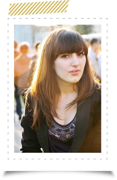
And here is a bigger, processed (a little bit, left the face) version of one of the photos:
 xoxo
xoxo
P.S Sorry for messy graphics. Hope you still could understand. AND I am not a pro. Don't judge me too strict :P
Frame and tape from Cut and Paste by Paislee Press
Lesson number 1: Don't shoot your models/objects when sun is shining right on them
Don't know why but I always thought that when sun is shining right at your object is good. No wonder I kept taking horrible overexposed photos. And then after doing a research and much practice I got it right. It turns out that the sun should be behind your models/objects, not behind you - photographer. Then there will be a beautiful glowing around your model (especially hair). Also if you want your photos to have smooth natural colors it is better to take photos in the morning or late afternoon. NOT between this time. Plus use a little impulse of your flash - it softens shadows on the face.
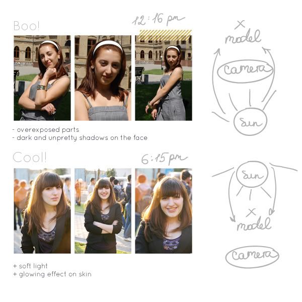 Didn't process the photos so you could see the difference.These pictures were taken by me with the same girl, same camera and lens! But at different time and different place of model. Amazing how little details in photography can play such an important role. Hope you find this information useful. If you I have more to add just leave a comment under the post. I will really appreciate that :)
And here is a bigger, processed (a little bit, left the face) version of one of the photos:
 xoxo
xoxoP.S Sorry for messy graphics. Hope you still could understand. AND I am not a pro. Don't judge me too strict :P
Frame and tape from Cut and Paste by Paislee Press